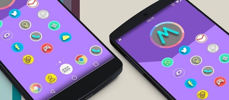
Google has updated its “Google App” for Android. Many new features have been added to the Google Application and one of the catchy features is now the updated Google app provides material design UI to the users of Google Now launcher and devices using the stock launcher!
This week is an important one for all the tech freaks out there because a major trade show is happening i.e. the CES but in between of all this, we’ve got some news for you. Google’s ‘Google’ App which was previously known as ‘Search’ has got an update to 4.1 version. Though we haven’t personally tested all the new features as of now but we will share whatever little we’ve found through digging in the app and let me tell you, there are a lot of goodies for you in this free app for you to make your Google experience more exciting than ever.
See more: Google removes authorship completely from search
Table of Contents
Google App updated for Android: “Now Cards”
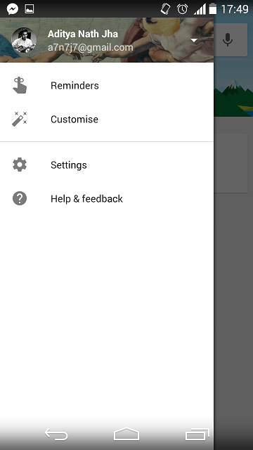
The new version of app has a new space in settings, which as the name goes, will give you control over the cards that Google presents to you. You can do many things like toggling cards on or off entirely or see your history of card on the web and controlling notifications and urgent updates management or even deleting all your preferences which were custom.
Google App updated for Android: Ok Google hotword detection
The screen toggle system for always-on hotword detection have also been revised by Google so that to make it clearer. In the “OK Google”, The Detection settings has changed from “When Locked” to “Personal results” so as to make it clearer that when toggle is on, you can access your personal information and actions from the secure lock screen too. This is different from the earlier versions of app when it was known as “Search” when, even after being triggered from a secure lock screen, some of the personal information like calendar appointments won’t show up.
Material design makeover of the whole app
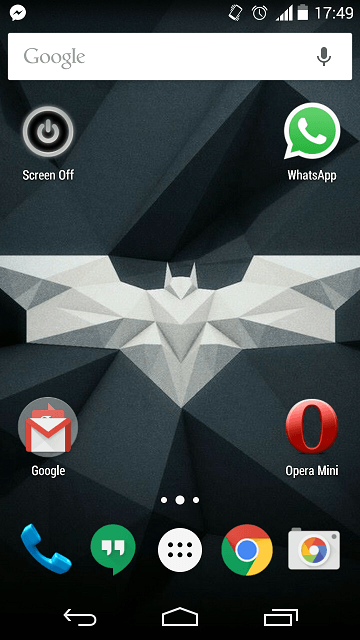
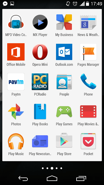
The stock cards have received layout updates as well and have a new layout. You can change size rather than colors of the stock cards by touching the dots in the divider between dock and desktop in Google’s launcher. And while we are talking about the Google Launcher, then one thing more about this which we would like to tell you is that tapping action of the launcher has also been changed in the way and is different from the earlier versions as previously the icons just increased the shadow size below it and tried to reach up to meet your fingers but now, as we tap the icons, it gets a lighter overlay too.
But a secret fact for you, this feature is not exactly brand new as it was available in earlier version too, actually it was available in Launcher3 code prior to this update. But due to some type of bug in the code, it was prevented from being revealed to the user.
Google design philosophy had inspired the voice typing also and it had got some attention from the developers which reflects in the better user experience and better design with a revised look.
Also to note for the Indian users of the app, Google has added nine Indian languages support in the app which includes Telugu, Malayalam, Punjabi, Kannada, Tamil, Gujarati, Marathi, Hindi and Oriya.
The icons along the bottom which are available after the execution of a Google search and allows the user to toggle in between the different categories of results have a much darker look now which is in contrast to the overall page.
The Google app now also allows user for a better and finer data management which is what it appears as of now. When you open the app’s info in settings, you can an option of managing spaces which is present as ‘manage space‘ which was not present in the earlier versions of the app.
After touching that button you can two distinct type of control for different kinds of data that the Google App uses. You also have the option to clear them both or one of them which you may not like.
If you notice any other kind of updates in the app then please mention them in comments below. You can download the new Google app from the below download link!
Note: To get Lollipop style design on your Android 4.1+ phone (Jellybean or higher version) install the Google Now launcher firstly and then this update. If you run into some trouble or don’t get the material design update then do comment below!

Keep visiting for more awesome Android news and articles and remember we cover, “Everything under the Sun!”

Follow Inspire2rise on Twitter. | Follow Inspire2rise on Facebook. | Follow Inspire2rise on Google+.
Stay Inspired to rise fellas!
Read more:
- How to download songs from Soundcloud in Android phones
- Zlauncher for Android download and review
- Enhance privacy on Google plus
- Contributor by Google launched as Invite only for publishers
- How to reduce tabs in Google Chrome
Discover more from Inspire2Rise
Subscribe to get the latest posts sent to your email.
